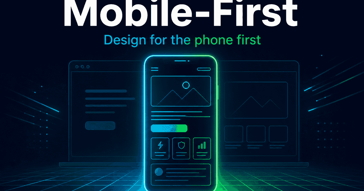
Most of your visitors will see your website on a phone first—especially across Egypt and the Gulf. If the desktop version looks great but the mobile experience is slow, cramped, or hard to tap, you lose leads and sales. Mobile-first is how modern sites avoid that.
Here’s what mobile-first means in practice, why it matters for your business, and what to demand from any redesign or new build.
What “mobile-first” actually means
Mobile-first means you design and build for the smallest screen first, then enhance for tablets and desktops—not the other way around.
In practice:
- Layouts start as a single column that’s easy to scroll
- Text is readable without pinch-zooming
- Buttons and links are large enough to tap with a thumb
- Images and scripts are optimized so pages load on slower networks
- Desktop gets more space and columns later—without breaking the phone experience
It is not “we shrunk the desktop site until it fit.” That approach usually creates tiny text, hover-only menus, and heavy pages.
Why it matters for your business
1. That’s where your traffic is
Search, social ads, WhatsApp links, and Google Maps all send people to phones. If mobile is an afterthought, you’re optimizing for the minority experience.
2. Speed is a sales feature
On mobile, every extra second of load time increases bounce. Heavy hero videos, unoptimized images, and plugin bloat hurt phones first.
3. SEO follows the phone
Google largely uses the mobile version of your site for ranking and indexing. A weak mobile experience can drag visibility even if desktop looks fine.
4. Conversion depends on thumb-friendly UX
Contact forms, “Get a quote,” and checkout must work with one hand. Menus that only work on hover, tiny form fields, and sticky bars that cover the CTA kill conversions.
Mobile-first vs “responsive”
Responsive means the layout adapts to screen size. That’s necessary—but not sufficient.
Mobile-first responsive means:
- Priority content and CTAs are clear on a small screen
- Performance budget assumes mobile networks
- Navigation is planned for touch (not only a wide mega-menu)
- Forms and checkout are tested on real phones
A site can be “responsive” and still feel broken on mobile if it was designed desktop-first and squeezed down.
A quick mobile readiness checklist
You’re in better shape when you can say yes to:
- Homepage and key pages are usable on a mid-range Android phone
- Primary CTA is visible without hunting
- Text contrast is readable outdoors / in bright light
- Forms submit successfully on mobile browsers
- Page feels fast on 4G, not only office Wi‑Fi
- No horizontal scrolling or overlapping elements
- WhatsApp / call / contact actions are easy to tap
If several answers are no, fix mobile before pouring budget into ads.
What this means for websites and online stores
For a business website, mobile-first shapes hero content, menus, and lead forms.
For ecommerce, it shapes product galleries, cart, and checkout—because abandoned carts on phones are expensive.
For apps, “mobile-first” is obvious; for marketing sites, it’s still the #1 place budgets get wasted when ignored.
Common mistakes
- Designing mockups only at 1440px width
- Using hover-dependent navigation with no touch alternative
- Compressing images for desktop quality on every device
- Popups that cover the whole phone screen and can’t be closed
- Testing only in a resized browser window—not on real devices
How EG Stars approaches it
We build sites that are fast and mobile-first by default: clear hierarchy on small screens, touch-friendly actions, and performance that holds up in real markets—not just on a designer’s laptop.
Summary
- Mobile-first = design and performance decisions start with the phone.
- It affects UX, speed, SEO, and conversion—not just “looking okay on mobile.”
- Responsive layout helps; mobile-first discipline wins.
Planning a new site or redesign? Get in touch—we’ll review your mobile experience and recommend a practical path to a site that works where your customers actually browse.